CSS
Intoduction to CSS
Html is just an skeletal layout of a website. Website need to design a website, add style to itand it look beautiful.
What is css?
CSS stands for cascading style sheets. css is an optional but it converts anoff look Htmlpage into a beautiful &resposive website.Chapter-1:Creating our First CSS Website
What is DOM?
DOM stands for document object model when a page is loaded, the browsers creates a DOM of the page which is constructed as a tree of objectsHTML ‘id’ and ‘class’ attributes:
When an HTML elements is givenan id, it serves as a unique identifier for that element. On the other hand, When an html element is given a class, it nowbelongs to that class. More than one elements can belongs to that class. More than class. More than one elements can belongs to a single class but every but every elements must have id (if assigned).We can add multiple classes to an elements like this:-
<div id="first" class="c1 c2 c3">
  </div>
Three ways to add CSS to HTML
- < style> tags:Adding < style> tags to html
- Inline CSS:Adding Css using style attributes
- External CSS:Addings stylesheet sheet link in html
CSS selectors:
A Css selectors os used to select an html elements for styling.
body{
    color: blue;
    backgroud-color:green;
  }
Element selectors:
It is used to select an element based off the tagname
h2{
    color:blue;
  }
Id selectors
It is used to an element with a given id :-
#first{
    color:white;
    background-color:black;
  }
class selectors:-
It is used to select an element with a given class.
.blue{
    background-color:blue;
  }
Important Notes:-
- We can group selectors like this:
h1,h2,h3{
    color:blue;
}- We can use elenment as a selector like this:
p .red{
    color:red;
}- ’*’ can be used as universal selectorto select all the elements.
*{
    margin:0;
    padding:0;
}- An inline style willoverride external and internal styles.
Comments in css:
Comments in css is test which is not parse and is thus ignored.
Chapter-2: CSS rules
CSS rules are simple key-value pairs with a selectors we can write css rules to change color set and backgroudsThe color property :-
The css color property can be used to set the text color inside an element.p{
color:red;
}similarly we can set color for different elements
Types of color
values: Following are the most commonly used color values in css: - rgb:specify color using red,green,blue - eg:-rgb(200,98,70) - hex:specify the color uding hex code - eg #ff7190 - hsl:specify the code using hsl values - hsl(8,90%,63%)The value of the color or background color is provided any of these values.
The background-color The CSS background-color property
specifes the background color of a cantainer..brown{
background-color: brown;
}The background-image property
Used to set an image as the background.
body{
    background-color:url("image.jpg");
  }
The image is by default repeated in x & y directions.
The background-repeat
property can be any of:- repeat-x:repeat in horizontal direction
- repeat-y:repeat in vertical direction
- no-repeat: image is not repeated anymore.
The background-size
property can be any of: - cover: fit and no empty remains - contain: fits and image is fully visible - auto: diplay in original size - {{width}} : set width and height will be set automatically - {{width}} {{hieght}} : set width and heightThe background-position property
Sets the starting position of a background image.div{@#39;img.png') no-repeat fixed right-top;
}One of the proprerties can be missing given others are in order
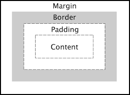
Chapter 3-CSS box model The css box model looks at allthe html elements as boxes:
Setting width and height in CSS as follows:
#box{
  height:70px;
  width:20px;
}
Note: that the total width/height id calculated as:-
Total height=height + top/bottom padding+top/bottom border + top/bottom margin
Setting Margin and padding
We can set margin and padding as follows: - Sets top,bottom,left,and right:
.box{
  margin:3px;
  padding:4px;
}- Assign margin seperately:
.boxmain{
  margin:7px 0px 2px 11px;
}- This assigns margin seperately but same top & bottom. Same to right & left:
.boxlast{
  margin:7px 3px;
}
We can also set indiviusual margins/paddings like this:
margin-top:2px; margin-bottom:2px; margin-left:2px; margin-right:2px;
Setting border
We can set the bordr as follows:
.bx{
border-width: 2px ;
border-style: solid;
border-color: blue ;
}
Border radius
We can set border radius to create rounded borders
.div2{
border-radius:7px;
}
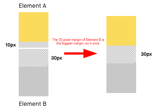
Margin collapse
When two margins from different elements onerlap, the equivalent
margin is the greater of the two . This is called margin collpse.
Box sizing Determines what out of padding and border is included in elements width and height. Can be content-box or border-box:
.div1{
box-sizing:border-box
}
Note:This conatins width and height includes content+padding+border
Chapter 4- Fonts & display
The display property
The css display is used to determine whether an element is treated as a block/inline element and the layout used for its children.
display:block
Takes only the space required by the element. No linebreaks before and after. settings width/height or margin/paddings not allowed.
display:
block takes full available in eidth and leaves newline before and after the elementdisplay:inline-block
similar to inline setting but height,width,margin and padding is allowed.Elements can set next to each & other.display:none vs visibility:hidden
- With display:none, the element is removed from the flow of the document.
- With visiblity:hidden, the element is hidden, the element is hidden but its space is reserved
text-align property
It is Used to set the horizontal alignment of a text..div1{
text-align:center;
}
text-decoration property
Used to decorate the text. It can be :
- underline
- line-through
- underline
- none
text-transform property
Used to specify and uppercase and lowercase letters in a text.p .uppercase{
text-transform:uppercase;
}
line-height property
used to specify the space between lines
.small{
      line-height:0.7;
    }
Fonts
Fonts plays a very impoertant role inthe look and fed of a website
font-family
font family specifies the font of a text can hold multiple values as a fallback system.p{
font-family:"Times new Roman", monospace;
}
Web safe fonts
These fonts are universally installed arcoss browsers
How to add Google fonts
In oder to use custom google,go to the fonts then select a style and finally paste it to the style.css of your page.Other font properties Some of the other font properties are listed below:
- fonts-size: sets the size of the font
- font-weight:sets weight of the fonts
- font-varient:sets whether text is displayed in small-caps
- fonts-style:sets the fonts style
Generic families
Broad class of similar fonts e.g:-serif,sans-serif. Just like when we say fruit, it can be any fruit.When we say serif it can any serif font.Chapter – 5 (Size, Position & Lists)
There are more units for describing size other than ‘px’ There are rem, em, vw, vh, percentages, etc.
What’s wrong with pixels?
Pixels (px) are relative to the viewing device. For a device with the size 1920x1080, 1px is 1unit out of 1080/1920.
Relative lengths
These units are relative to the other length property. Following are some of the most commonly used relative lengths,
- em – unit relative to the parent font size em means “my parent element’s font-size”
- rem – unit relative to the root font size (< html > tag
- vw – unit relative to 1% viewport width
- vh – unit relative to 1% viewport height
- % - unit relative to the parent element
Min/max- height/width property
CSS has a min-height, max-height, and min-width, max-width property. If the content is smaller than the minimum height, minimum height will be applied.
The position property
Used to manipulate the location of an element Following are the possible values: - static: The default position. top/bottom/left/right/z-index has no effec) - relative : The top/bottom/left/right/z-index will now work. Otherwise, the element is in the flow of the document like static. - absolute: The element is removed from the flow and is relatively positioned to its first non-static ancestor. top/bottom etc. works - fixed: Just like absolute except the element is positioned relative to the browser window - sticky: The element is positioned based on the user’s scroll position
list-style property
The list-style property is a shorthand for type, position, and image
ul{
      list-style: square inside url(‘harry.jpg’)
    }
‘square’ in the above code is the list-style-type, ‘inside’ is the
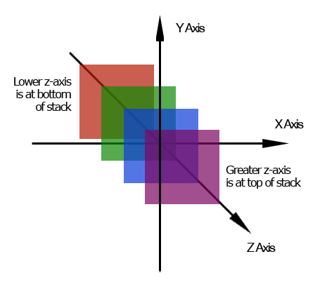
list-style-position and ‘harry.jpg’ is the list-style-image. z-index
property The z-index property specifies the stack order of an element.
It defines which layer will be above which in case of overlapping
elements.
Chapter – 6 (Flexbox)
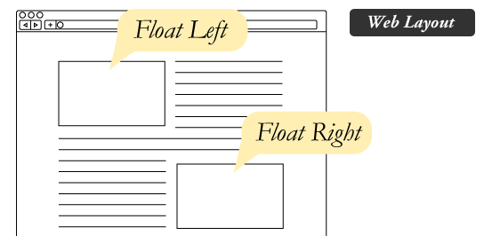
Before we look into the CSS flexbox, we will look into float and
clear properties. The float property float property is simple. It just
flows the element towards left/right
The clear property
Used to clear the float. It specifies what elements can float beside a given element
The CSS Flexbox
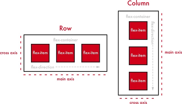
Aims at providing a better way to layout, align, and distribute space among items in a container.
.container{
    display: flex;                  /*Initialize a flexbox*/
    }
flex-direction property
Defines the direction towards which items are laid. Can be row (default), row-reverse, column and column-reverse
Flex properties for parent (flex container)
Following are the properties for the flex parent:
- flex-wrap: Can be wrap, nowrap, wrap-reverse. Wrap items as needed with this property
- justify-content: Defines alignment along the main axis
- align-items: Defines alignment along the cross axis
- align-content:Aligns a flex container’s lines when there is extra space in the cross axis
Flex properties for the children (flex items)
Following are the properties for the flex children:
- order:Controls the order in which the items appear in the flex container
- align-self: Allows default alignment to be overridden for the individual flex items
- flex-grow: Defines the ability for a flex item to grow
- flex-shrink: Specifies how much a flex item will shrink relative to the rest of the flex items
Chapter – 7 (CSS Grid & Media Queries)
A CSS grid can be initialized using:
.container {
     display: grid;
    }
All direct children automatically become grid items
The grid-column-gap property
Used to adjust the space between the columns of a CSS grid
The grid-row-gap property
Used to adjust the space between the rows of a CSS grid
The grid-gap property
Shorthand property for grid-row-gap & grid-column-gap
.container {
      display: grid;
      grid-gap: 40px 100px;            /*40px for row and 100px for column*/
    }
Note: For a single value of grid-gap, both row and column gaps can be set in one value.
Following are the properties for grid container:
- The grid-template-columns property can be used to specify the width of columns
.container {
      display: grid;
      grid-template-columns: 80px 120px auto;
    }
- The grid-template-rows property can be used to specify the height of each row
.container {
      display: grid;
      grid-template-rows: 70px 150px;
    }
- The justify-content property is used to align the whole grid inside the container.
- The align-content property is used to vertically align the whole grid inside the container.
Following are the properties for grid item:
- The grid-column property defines how many columns an items will span.
.grid-item{
      grid-column: 1/5;
    }
- The grid-row property defines how many rows an item will span.
- We can make an item to start on column 1 and space 3 columns like this:
.item{
      grid-column: 1/span 3;
    }
CSS Media Queries
Used to apply CSS only when a certain condition is true.
Syntax:
@media only screen and (max-width: 800px) {
     body{
     background: red;
          }
      }
Chapter – 8 (Transforms, Transitions & Animations)
Transforms are used to rotate, move, skew or scale elements. They are used to create a 3-D effect.
The transform property
Used to apply a 2-D or 3-D transformation to an element
The transform-origin property
Allows to change the position of transformed elements 2D transforms – can change x & y-axis 3D transforms – can change Z-axis as well
CSS 2D transform methods
You can use the following 2-D transforms in CSS:
- translate()
- rotate()
- scaleX()
- scaleY()
- skew()
- matrix()
CSS 3D transform methods
- rotateX()
- rotateY()
- rotateZ()
CSS Transitions
Used to change property values smoothly, over a given duration.
The transition property
The transition property is used to add a transition in CSS. Following are the properties used for CSS transition:
- transition-property: The property you want to transition
- transition-duration: Time for which you want the transition to apply
- transition-timing-function: How you want the property to transition
- transition-delay: Specifies the delay for the transition All these properties can be set using a single shorthand property
Syntax:
transition: property duration timing-function delay;
    transition: width 35 ease-in 25;
Transitioning multiple properties
We can transition multiple properties as follows:
transition: opacity 15 ease-out 15, transform 25 ease-in;
CSS Animations
Used to animate CSS properties with more control. We can use the @keyframes rule to change the animation from a given style to a new style.
@keyframes harry {
      from { width: 20px; }              /*Can change multiple properties*/
      to { width: 31px; }
    }
Properties to add Animations
Following are the properties used to set animation in CSS:
- animation-name: name of the animation
- animation-duration: how long does the animation run?
- animation-timing-function: determines speed curve of the animation
- animation-delay: delay for the start of an animation
- animation-iteration-count: number of times an animation should run
- animation-direction: specifies the direction of the animation
Animation Shorthand
All the animation properties from 1-6 can be applied like this:
animation: harry 65 linear 15 infinite reverse;Using percentage value states with animation
We can use % values to indicate what should happen when a certain percent of animation is completed
@keyframes harry {
      0% {
       width: 20px;
         }
      50% {
       width: 80px;
          }
      100% {
       width: 200px;
           }
        }
Can add as many intermediate properties as possible
credit:
- @codewithharry
- @software chasers